Welcome to As You Like It Challenge
Our fortnightly challenge is a home for you to create something
which gives you a warm "inner glow" of pride, without lots of entry rules.
Usually we provide options for you to choose from.
You just need to select and use your favourite option in order to join in.
For a chance to win our prize or top-3 spot,
you need to tell us why you've made your choice.
That way our team and readers can appreciate why it's your favourite.
eg, if the theme is 'favourite animal' and you decide on 'bunny', tell us why.
eg, you love Thumper, the rabbit from Bambi !
So get crafting and remember to have fun
and enjoy your crafting time.
Thank you to everyone who entered our last challenge.
Our winner is:
#18 Jacinda
Please email us at AsYouLikeItChallenge@hotmail.co.uk to claim your prize,
and don't forget to grab your *winners* badge below:
#10 Mary Marsh
#80 Katrina Bufton
#83 Lynn
Congratulations and please grab our *Top 3* badge to display on your blog:
This fortnight's challenge theme is to showcase a project using
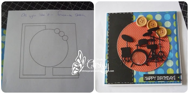
Your Favourite Sketch or Layout (& why).
You MUST explain WHY it is your favourite.
Here are the beautiful creations made by our Design Team to get your mojo flowing:
I flit between favouring fussy cards to clean and simple layouts, so it's difficult to narrow down a single favourite 'sketch' layout. Today I'm in clean and simple mood, and this layout is one of my favourites: a curving top banner of pretty papers arching over my stamped image, with a thin strip of the same papers below the image panel to balance it out. I've dressed it up a little more than normal with a double layer of papers (just using the offcut from the first cut) and added a trio of flat backed pearls for a some texture.
My sketchy likes are all over the place. I really like this sketch because I feel it works well with my image. Sketches are a great place to start a card, especially if you have low mojo.
I can honestly say I have never followed a sketch as far as I can remember, I tend to wander off in my own direction once started..so I found this sketch online and gave it a go..
I don't usually use sketches and my layouts vary quite a bit. So I made this card using this sketch loosely which I think suits these butterflies perfectly.
Most of my cards are clean and simple and I don't use a lot of patterned paper. This is my favourite layout when I want to use a little bit of patterned paper and then my card is still clean and simple.
I don't follow any particular sketches and I think it all depends on your image, but when I'm stuck for an idea this always seems to be my "go to" layout so it must be my favourite. I'll have to try and be more adventurous!
If I get stuck for a layout idea (and it happens often) or just need something fresh, then I'll pop over to the MFT Blog where they have a fabulous library of sketches from past challenges. This one is very simple but surprisingly effective, and I have used it a few times now.
I have a board with sketches on Pinterest. I love to use card sketches. This is one of my favorite from MFT. I have a lot of design paper pads and with this sketch I can use up some of that papers.


.JPG)


What an honor to be chosen as one of your Top Three from all the gorgeous card in Cute or Floral Challenge!! Thank you so much for this wonderful recognition of my work!
ReplyDelete