Hi everyone Suzette here thanks to everyone who entered our last challenge.
Our winner for last week is:
#40 KYM

Please email us at AsYouLikeItChallenge@hotmail.co.uk to claim your prize,
and don't forget to grab your *winners* badge below:

and our Top 3 are
Kristina Pavlovic

Liz Marsden

and
Elena F
Congratulations and please grab our *Top 3* badge to display on your blog:

This fortnight's challenge theme is to showcase a project using
your Favourite Layout (& why).
your Favourite Layout (& why).
You MUST explain WHY it is your favourite.
Here are the beautiful creations made by our Design Team to get your mojo flowing:
I love this layout which showcases two complementary papers on each half of a square card base with a ribbon covering the join. I often also pop a bow using the same ribbon at the side of the image panel using a pearl brad to hold it in place, and of course my trios of pearls in the corners.
Ohhhh This is my favourite because it is C&S and so quick to
make and Its my own sketch and its my go to when I am in a rush or if i just want the image to speak for itself....
Brenda
I love any layout with banners. This one is so simple, no fuss but still interesting.
Carol
Use this kinda layout when using a sentiment as the focal point and because it shows of the pretty papers perfectly.
Elaine
This is one of my favourite layouts. I use it often and it always looks good, even when rotated.
Kat
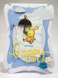
Any layout with this lovely shaped base is always a favourite for me, and I especially loved adding all the details around the central image circle for this design...it even makes it easy to add a name and age!
Lori
I have a few favourite layouts but I especially like the CAS layouts where the main image is the main focal point - to me, your eye is drawn immediately to that image and it really makes a statement!
Lorraine
My favourite layout has lots of layers, I like the interesting detail you can achieve with the dimension. I am in to using Dies at the moment so this is my card, using dies and lots of layers.
Mojca
I must confess that I like square shape layouts because I think the image really has it's moment there. This one is one of my favourites because the sentiment also really stands out.
Sarah
I am really enjoying sketches at the moment and this particular layout is a favourite as it showcases patterned papers beautifully.
Suzette
I love to see cards that have lots of layers on them...It gives them depth and interest and almost a 3D effect.
Wilma
My favourite layout is `simple`. Not to many layers because I like to see a lot of the DP I use on a card. Mostly I use 3 or 4 layers, but that also depends on the sketch and the stamp that I am going to use.
So now it's your turn.
We hope you will join in our challenge, show us your style and
showcase your Favourite Layout (& why).
You MUST explain WHY it is your favourite.
Good luck, and happy crafting.
Hugs from the AYLI girls.


